Adaptive planning, check-ins, anchors, reminders, and persistence.
Back to work
Functioning iOS prototype
Time Anchor
Working SwiftUI system for adaptive planning, check-ins, reminder routing, and variable-capacity days.
Adaptive execution supportVariable-capacity days
- Observe
- Infer
- Intervene
- Learn
Users don't fail because they forgot the plan.
They fail during starting, transitioning, recovering, and adapting.
At a glance
A planner should not stop at organizing a day. Time Anchor shows how a planning system can support starting, switching, recovering, and adapting when capacity changes.
Strategy, interaction model, prototype behavior, and validation framing.
Planner logic, reminder routing, SwiftData, tests, and simulations.
Reframes planning around starting, switching, recovery, and capacity.
Behavioral modeling and usability critique.
Problem
Most planners assume that once a plan exists, the user can execute it. Time Anchor explores what a planner should do when attention, energy, transitions, and recovery change throughout the day.
Why this matters
- Users do not just forget tasks; they lose the ability to start, switch, recover, or choose the next move under pressure.
- Transitions and recovery periods are often where a plan collapses, even when the calendar is accurate.
- Static plans punish variable capacity. The useful system is the one that adapts without making users decode the adaptation.
Design challengeHow might a planner reduce execution friction instead of simply organizing information?
Three adaptive days
The demo scenarios test whether support can adapt without becoming generic.
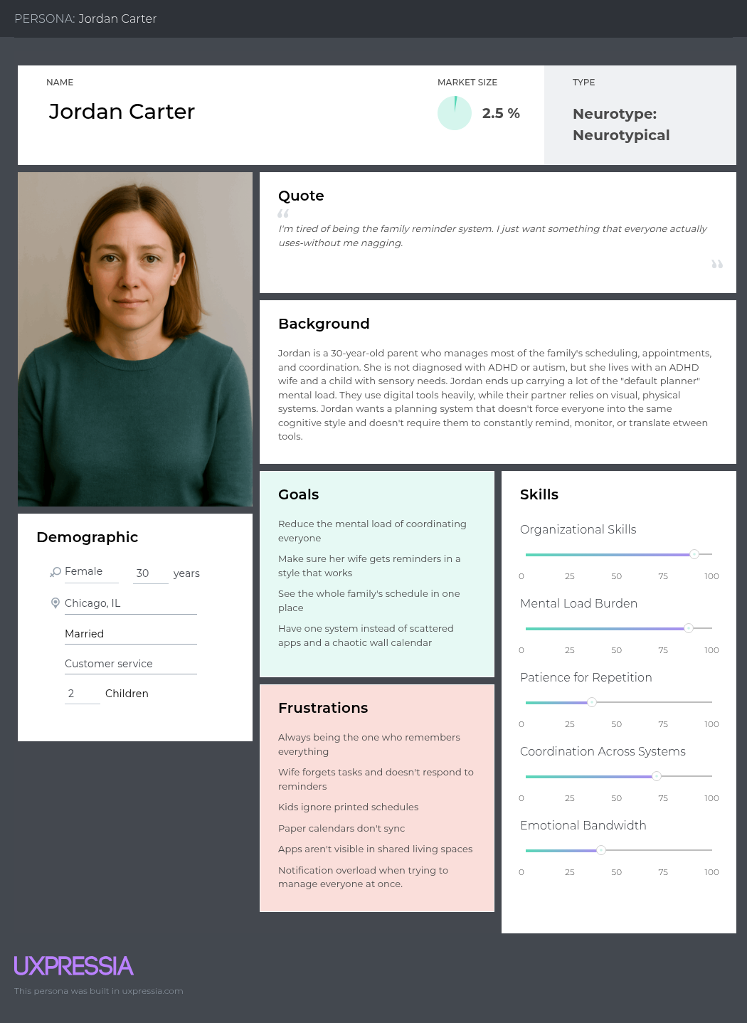
Jordan Carter
Need: Reduce household coordination load without becoming the family reminder system.
App response: Shared commitments, reminder handoffs, family anchors, and clearer responsibility boundaries.
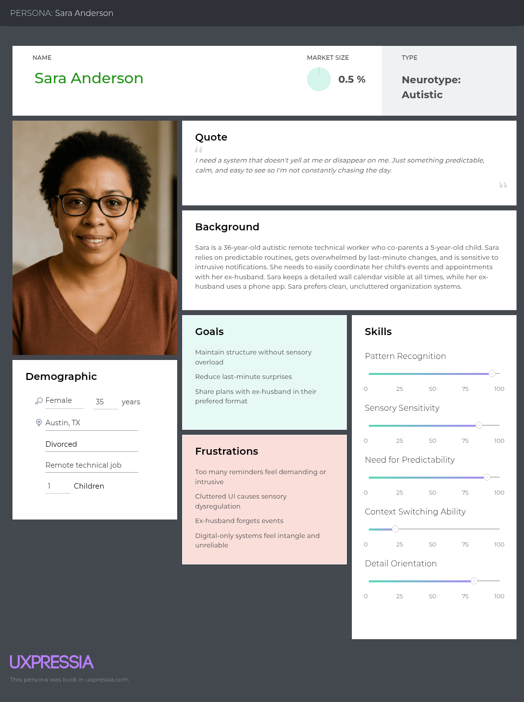
Sara Anderson
Need: Predictable co-parenting support with uncluttered, low-stimulation structure.
App response: Fixed commitments stay separate from flexible tasks, so childcare constraints do not become fake to-dos.
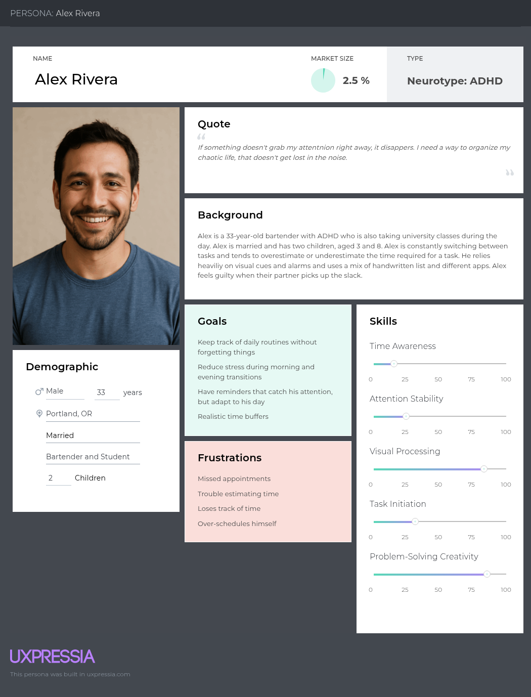
Alex Rivera
Need: ADHD time awareness across school, work, parenting, and commute transitions.
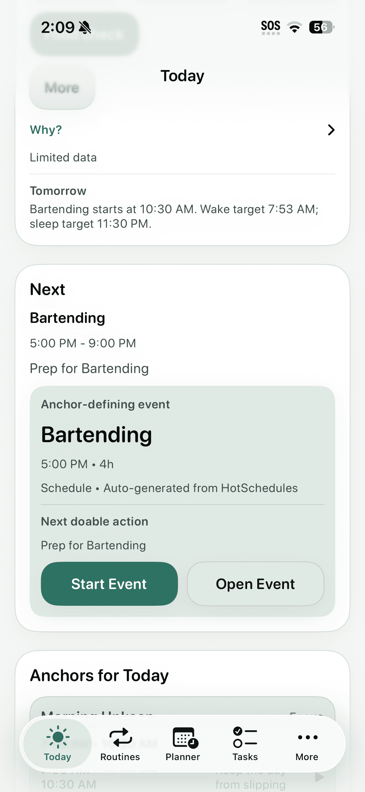
App response: Buffers, current action, next fixed commitment, leaving countdowns, and tomorrow preview.
Journey evidence
Alex's morning failures clustered around time estimation, transition friction, and leaving.
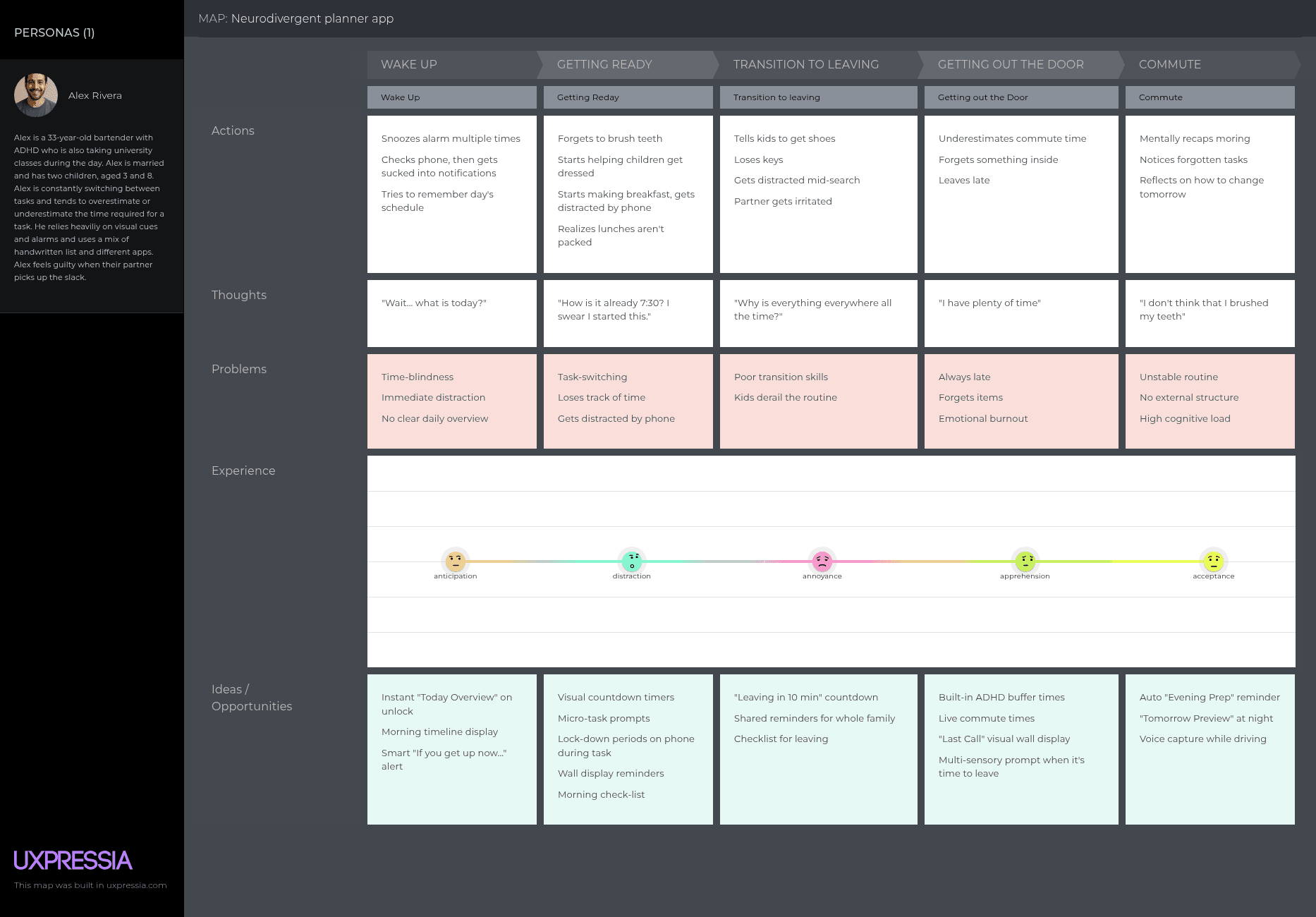
Today overview on unlockVisual countdownsMicro-task promptsADHD buffer timeTomorrow preview
System model
Observe -> Infer -> Intervene -> Learn
01
Observe
Missed starts, ignored cues, calendar pressure, capacity check-ins, and health context.
02
Infer
Drift risk, overload pressure, transition friction, recovery need, and commitment pressure.
03
Intervene
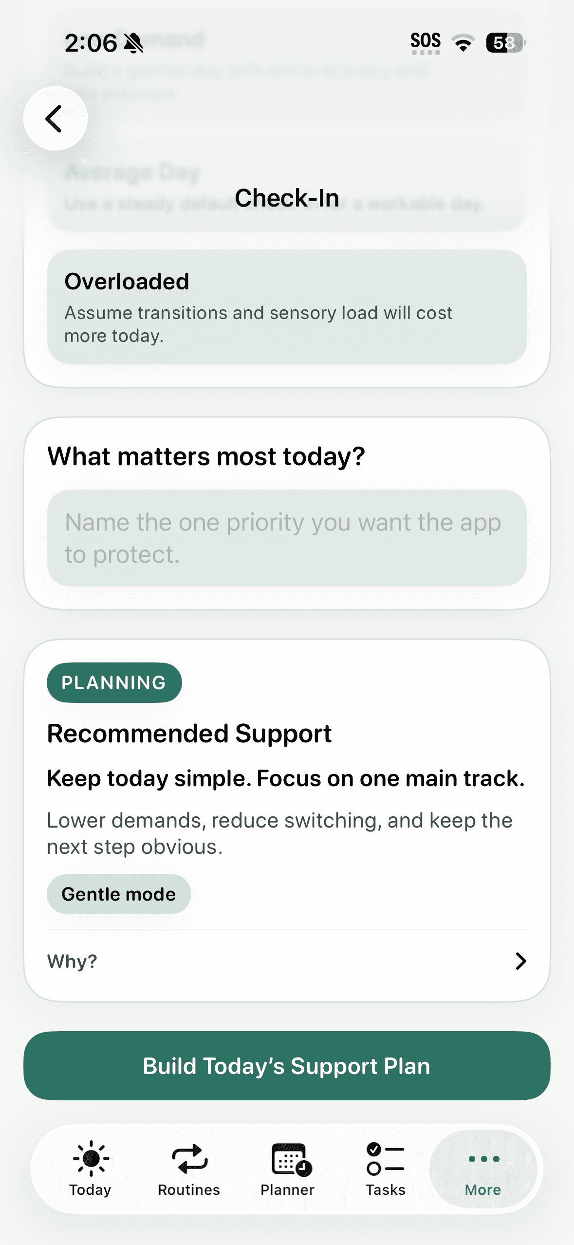
Cue adjustment, anchors, simplified plan modes, transition support, and recovery mode.
04
Learn
A future-facing path for reminder timing, support tone, event relevance, and anchor behavior.
Design evolution
Research mapping became an anchor-based planning system.
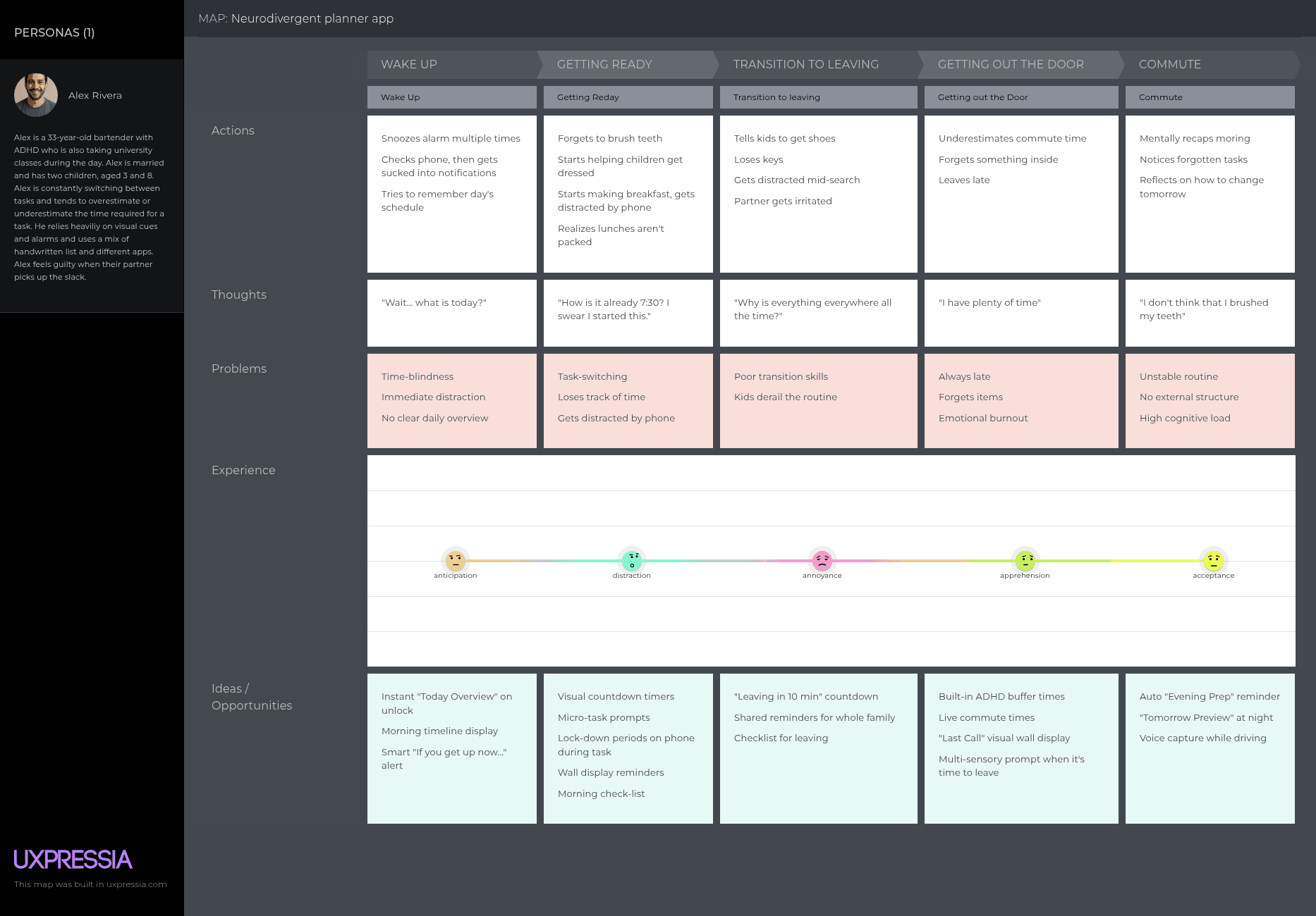
Morning transitions
A journey map located the failures in starting, switching, leaving, and recovering rather than in task storage.
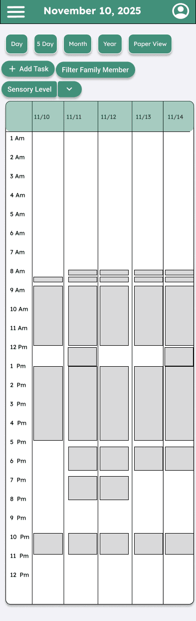
Five-day concept
An early planning view tested days as visible shapes with capacity and sensory support, not a conventional calendar grid.
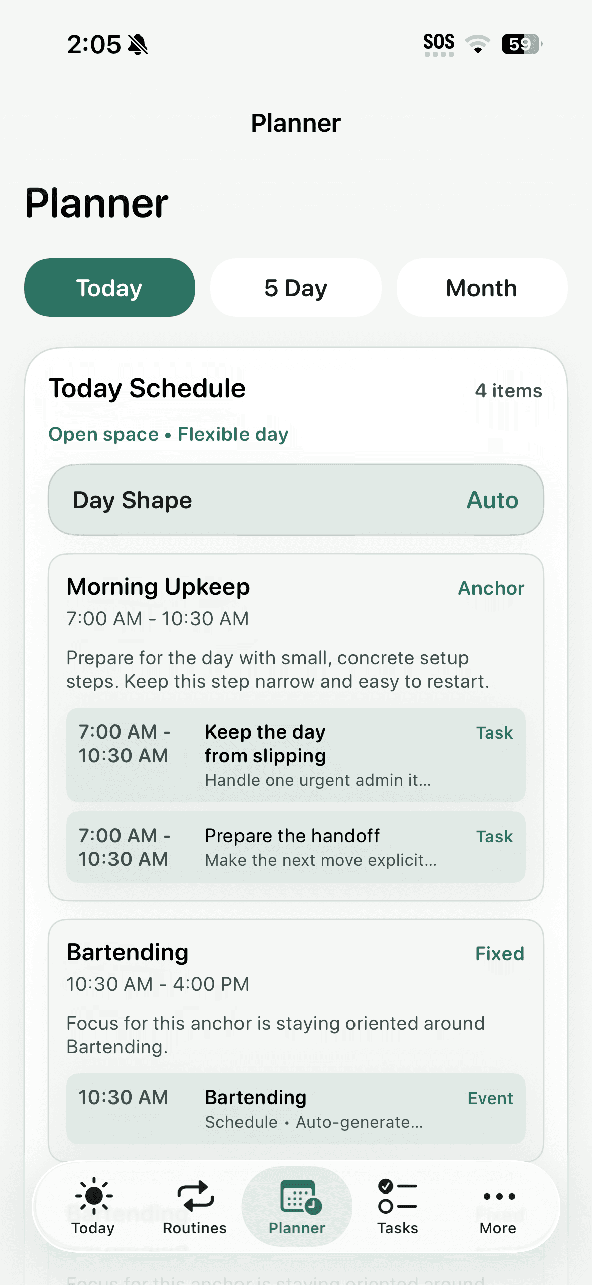
Adaptive planner
The SwiftUI prototype made the current anchor, recovery state, and next action operational.
Flagship scope
What is built, what is strategic, and where the boundaries are.
Built prototype
- SwiftUI iOS app with support-profile onboarding.
- Manual capacity check-ins and health/context inputs.
- Tasks, routines, fixed events, anchors, and adaptive planning modes.
- Reminder routing into the relevant task, routine, transition, or wrap-up state.
- Engagement tracking, SwiftData persistence, legacy migration, tests, and simulation checks.
Strategic extension
- Employee wellbeing benefit access model.
- Aggregate adoption and self-reported usefulness reporting.
- De-identified usage trends only with explicit privacy boundaries.
Scope boundaries
- Clinical outcomes are outside the current product scope.
- Employer-sponsored access would exclude individual calendar, health, neurotype, task, and check-in data.
- Correction capture is framed as a future planning input, not a fully automated behavior change.
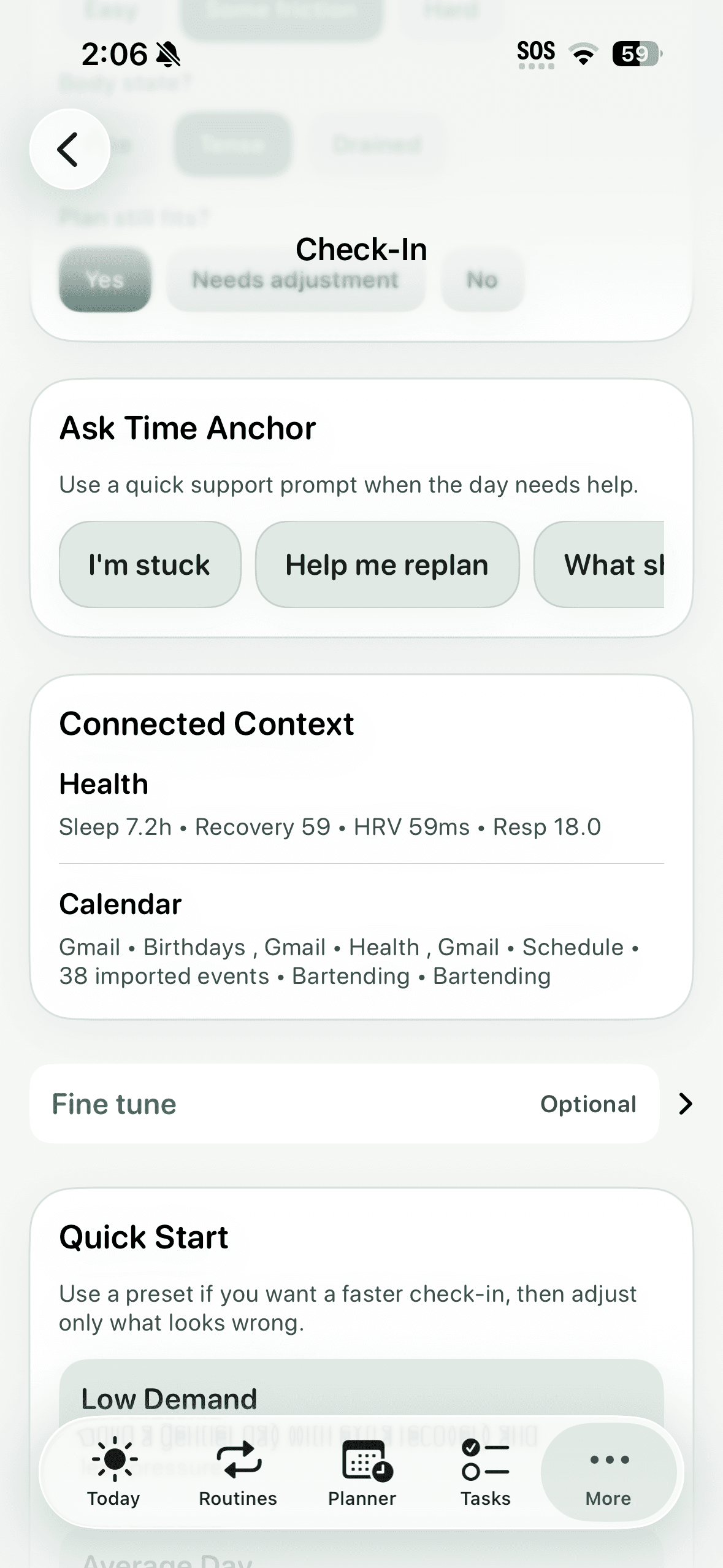
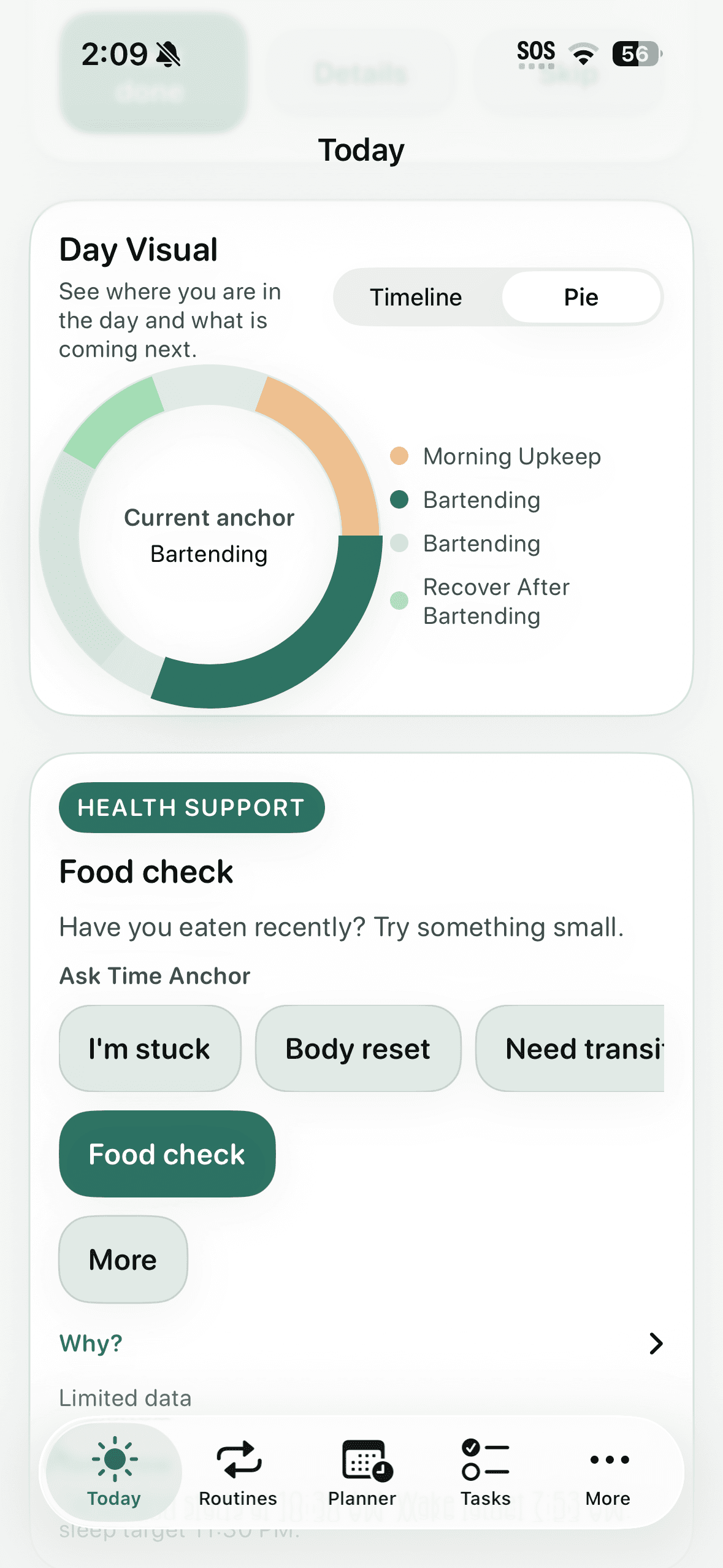
Real app states
The newer screens make the product feel operational instead of conceptual.
Process artifacts
The product logic is the visual story.
I treated this as an execution problem, not a calendar problem. The design work focused on where a day breaks down: the moment before starting, the handoff between activities, and the recovery point after a plan stops matching capacity.
Morning upkeep
Focus block
Recovery
Shutdown
01Observe
02Infer
03Intervene
04Learn
What shaped the system
Support needed to adapt without becoming another task.
Use anchors instead of a flat task list
Decision: Group the day into meaningful execution blocks such as morning setup, focus, recovery, and shutdown.
Tradeoff: Less granular than a full calendar, but easier to act on during high-friction moments.
Separate events from tasks
Decision: Keep fixed commitments visually and semantically distinct from executable work.
Tradeoff: The data model has to carry more context about each item, but the user gets a clearer day map.
Make explanations optional
Decision: Lead with Now, Next, and Day Map; move system reasoning into a secondary Why layer.
Tradeoff: Some intelligence is less visible, so trust has to be built through consistency and recoverable choices.
Design walkthrough
How the prototype responds when the plan stops matching the day.
Support profile
Captures support preferences, neurotype context, reminder posture, and sensory cue preferences.
User problem
Avoids treating neurodivergence as one default mode.
Design response
The framing moved from diagnosis-first to support-pattern-first.
Capacity check-in
Lets the user update energy, stress, sensory load, transition friction, and recovery need.
User problem
Gives the planner a way to respond when the day no longer matches the original plan.
Design response
Manual check-ins stayed first-class so the concept does not depend on wearable data.
Today execution surface
Prioritizes what is happening now, what is next, and what the day is asking from the user.
User problem
Reduces the uncertainty of deciding where attention should go.
Design response
The hierarchy was tightened around Now / Next / Day Map / Why after critique.
Correction capture
Records feedback such as too early, too late, too intense, not relevant, or already moving.
User problem
Creates a path for the system to stop repeating support patterns that miss the user's actual state.
Design response
Corrections are designed to eventually feed planning signals into future iterations, rather than being treated as isolated UI edits.
Where this goes next
The B2B extension only works if the employee stays the owner of the data.
Employee
Personal plans, reminders, check-ins, routines, health guidance, and insights.
Employer
Aggregate adoption, retention, and self-reported usefulness. No individual behavioral data.
Benefit partner
De-identified usage trends and opt-in outcomes.
Manager
No access to tasks, calendar events, health data, neurotype, check-ins, late starts, or recovery patterns.
Can users identify what to do now within five seconds?
Do reminders help users start tasks instead of only alerting them?
Do wrap-up reminders help users leave hyperfocus?
Are anchors understood as day chunks rather than events?
Is the privacy boundary understandable in an employer-sponsored version?
01Current state
02User ignores cue
03What felt off?
04Future support adapts
Research basis
This is a documented cognitive problem, not just a planner preference.
People are slower and often more error-prone immediately after switching tasks, and preparation reduces but does not remove that cost.
Monsell, Trends in Cognitive Sciences, 2003Cross-national survey research estimated adult ADHD prevalence at 3.4%, with measurable role disability and low ADHD-specific treatment.
Fayyad et al., British Journal of Psychiatry, 2007Time Anchor treats planning as an execution-support problem: starting, switching, recovering, and adapting when capacity changes.
Applied product framingAI's role
I used the agent to make the case study more accurate, not just more polished.
SwiftUI source, planning engine, intelligence services, tests, and simulation checks.
Audit the implementation against the case-study claims and find where the story was under- or over-stated.
Separated what was actually built from what was strategic or future-facing, then tightened the page around accurate proof.
Research / testing
Evaluate whether the concept reads as execution support rather than another calendar, and whether adaptive logic can remain understandable.
Prototype critique, scenario review, persona walkthroughs, and implementation-level checks against planner behavior.
The strongest product story is adaptive execution support, not task storage.
Events and tasks must remain separate or the planner becomes noisy.
The day's main action needs to be visible before support copy or explanation.
Adaptive behavior needs an explanation layer, but that layer should not compete with the immediate next action.
The case study and prototype now emphasize anchored day structure, a clearer Now/Next hierarchy, support transparency, and correction capture as a future planning input.
Outcome
Working SwiftUI prototype with adaptive planning modes, check-ins, reminder routing, anchors, SwiftData persistence, and a privacy-first strategic extension.

The strongest part of Time Anchor is the reframing: planning is not finished when the schedule is created.
Reflection
What this project sharpened.
The strongest part of Time Anchor is the reframing: planning is not finished when the schedule is created.
The next iteration should test whether users trust adaptive changes when the explanation is available but not forced.
Designing for cognitive variability requires restraint; too much visible intelligence can become another task.